The Curse of Strahd NPC pack, painted over six weeks
Wren emailed me on a Sunday night in March. She was running Curse of Strahd in person for the first time, eight players around her dining table, and she wanted portraits the group could actually hold in their hands. Index cards with names, she said, were not cutting it. The party kept forgetting who Ismark was. Could I paint the whole core cast as a pack, matched in style, ready before her session zero in May?
Six weeks later, I shipped her eight portraits and a small handoff PDF. This is how that pack came together, and what I learned about keeping a roster of NPCs visually coherent when the source material spans a vampire lord, a Vistani seer, and a teenage politician with bad hair.
Why an NPC pack works for a campaign module
A published module gives you a known cast. Players who have done any research at all will arrive at the table with a mental image of Strahd, and that image is usually wrong, or at least generic. Painting the pack in one continuous run lets me solve a problem that single commissions can't: every face shares a lighting language, a paper texture, a color logic. When Wren slides Ireena across the table and then Madam Eva, the players feel like they are inside one world, not flipping between fan art tabs.
There is also a schedule argument. Eight separate commissions, spaced across a year, would cost more and look less unified. A pack lets me batch the early stages. I do all the thumbnails in one week, all the value studies in another, and then go deep on rendering with the palette already locked. The math works out for everyone.
The kickoff call
Wren and I spent ninety minutes on a video call before I touched a brush. We made four decisions that constrained every painting that followed.
Palette. Barovia is desaturated. The book leans into greens, browns, blood reds, candlelight yellows. I proposed a palette of seven colors plus a near-black and a bone white, and we agreed to ban pure cyan, pure magenta, and any saturated orange. That sounds restrictive. It is the whole point.
Era. Late Renaissance dress with Eastern European cuts. Ireena would wear something her father, a burgomaster, could afford. Strahd would dress in centuries-old fashion that he refuses to update. Ezmerelda was the only character allowed any visible modernity, leather boots and a coat that has seen actual travel.
Tone. Wren wanted dread, not horror. The portraits should feel like the players walked into a house at dusk, not into a haunted attraction. That meant no blood on faces, no glowing eyes, no obvious fang reveals. The horror sits in the eyes and the posture.
Light direction. This was the decision I cared about most. I picked a low, warm key light from camera-left for every portrait, with a cooler ambient fill from the right. Eight portraits, one sun. When you lay them side by side on a table, your brain reads them as the same room.
Week 1-2: Strahd and Ireena
I started with the central duo because they would set the standard for everything else. If I could nail the visual relationship between them, the rest of the pack would have a north star.
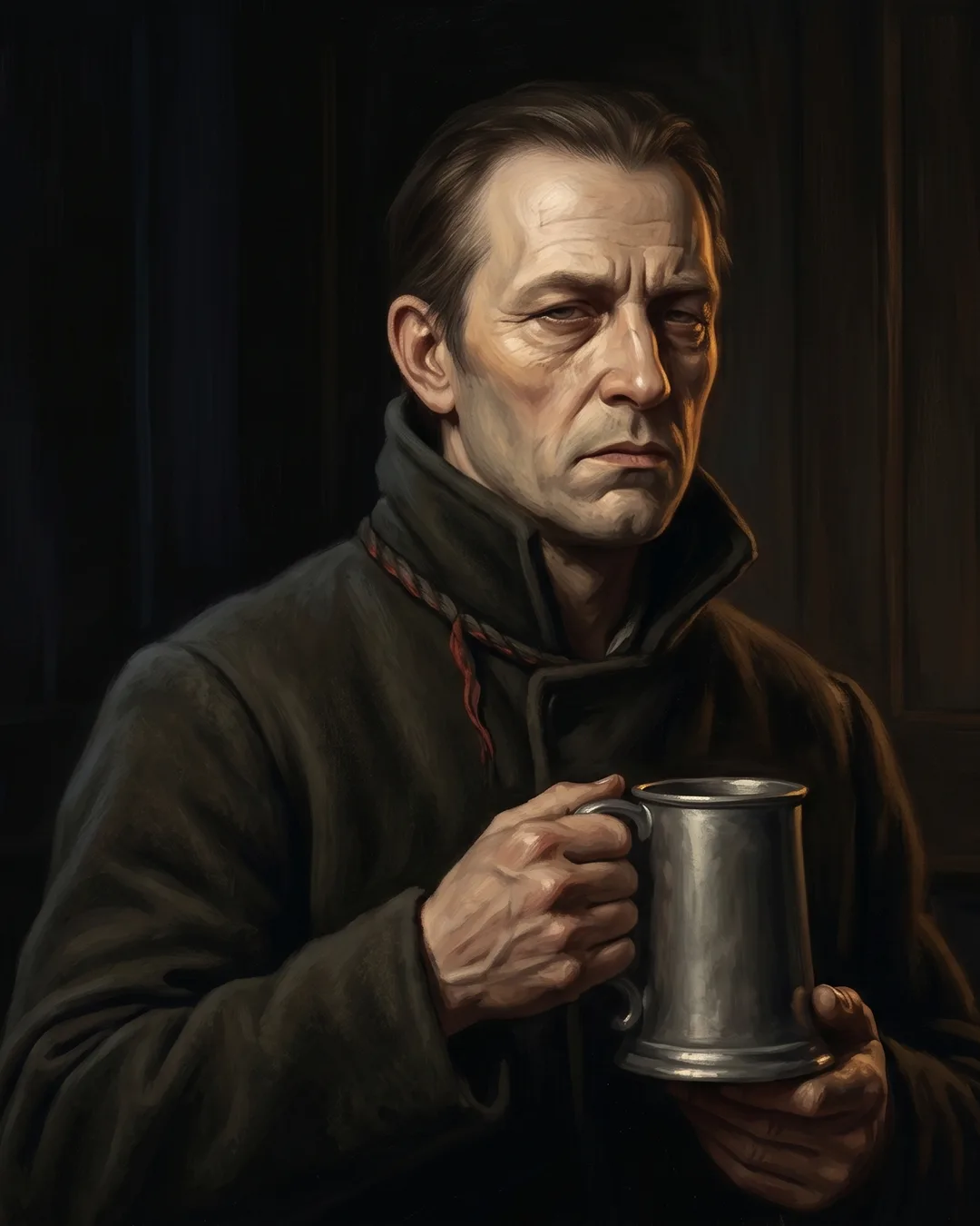
Strahd was painted in three-quarter view, looking slightly past the viewer. I gave him a high collar in deep ox-blood, almost black until you tilt the page, with the warm key catching the right side of his jaw and leaving the left half of his face in shadow. His skin is a thin layer of pale ochre over a green underpainting, which is the technique I use when I want something to read as not-quite-alive without going full corpse. His eyes are a desaturated gray, not red. Players see red eyes in every Strahd image online. Gray is more unsettling because it reads as human first, then wrong.
Ireena was the mirror. Same lighting setup, same camera angle, but flipped: she catches the key light on the left side of her face, so when the two portraits sit next to each other on the table, the light falls toward each other. They are illuminating each other across the page gap. Her palette is warmer, copper hair against a soft moss-green dress, with skin painted over a pink underlayer so she reads as fully alive. The contrast does the storytelling. I did not need to put a vampire next to a victim. The light did it.
The color block is the bones. If the bones are wrong, no amount of polish will save it.
I think about that sentence every time I start a pack.
Week 3-4: Madam Eva, Rictavio, Ezmerelda
The supporting cast is where a pack can fall apart, because each character has a strong visual hook that wants to dominate. My job is to honor the hook while keeping the palette and lighting under control.
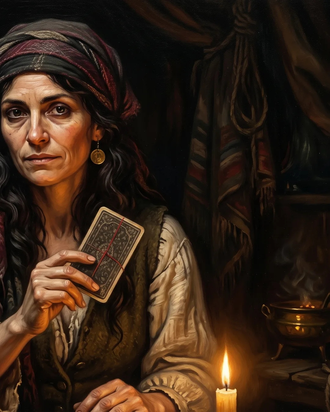
Madam Eva got the most saturated piece in the pack, which was a deliberate exception. Her shawl uses a deep madder red that I kept off every other portrait, so when she enters the story, she enters with a color the players have not seen. Her face is painted with heavy texture, deliberate brush marks left visible in the skin, because she is meant to read as ancient and weathered. I lit her from below with the campfire bouncing warm light up under her chin, then dropped the key light to almost nothing. She is the only portrait in the set lit primarily by fire.
Rictavio was the trickiest. He is Rudolph van Richten in disguise, a vampire hunter performing as a traveling entertainer, which means I had to paint a portrait that hides a second portrait inside it. I gave him a slightly theatrical posture, a waxed mustache that does not quite sit right, and eyes that are doing none of the work his smile is doing. Wren told me later that her players spent twenty minutes at the table just staring at his face trying to figure out what was off. That is the painting working.
Ezmerelda was a relief to paint after Rictavio. She is straightforward: a half-Vistani monster hunter who knows exactly who she is. I painted her in a leather coat with a silver holy symbol just visible at her throat, lit cleanly, looking directly at the camera. She is the only NPC in the pack making direct eye contact. The players were meant to read her as trustworthy, and direct gaze is the cheapest, most reliable way to do that.
Week 5: Kasimir and Victor
Most Strahd packs stop at six NPCs. Wren and I agreed early on that the last two slots should go to characters who are easy to overlook but who reward a portrait at the table.
Kasimir Velikov is a dusk elf in mourning, obsessed with bringing back his sister. He was a chance to break the human-face monotony that creeps in across a pack of eight. I painted him in profile, looking off-frame, with the key light catching the back of his head and rim-lighting his ear rather than his face. His skin is the coolest in the pack, a desaturated lavender-gray, which lets him sit visually apart from the Barovian humans without screaming "elf." His grief is in the posture, shoulders rotated slightly away from the viewer, hands not visible.
Victor Vallakovich was the wildcard. He is a sixteen-year-old apprentice wizard with delusions of competence, son of the Vallaki burgomaster, and he is genuinely funny if you play him right. I painted him three-quarter, slightly too close to the picture plane, with a robe that is one size too big and a singed sleeve he clearly does not want you to notice. His key light is brighter than anyone else's in the pack, almost overexposing his forehead, because he is the one character whose tone is comic relief, and warm overexposure reads as that. He is also the only portrait where I let the background go nearly white. Every other piece has a dim, textured background. Victor gets clean light because he does not yet understand what he is living through.
Week 6: Final pass and tokens
The last week is mostly invisible work. I pulled all eight portraits onto one canvas, scaled them to identical head sizes, and went through correcting drift. Strahd's skin had crept warmer over the weeks. Ireena's hair had gotten slightly too red. Madam Eva's red shawl needed to come down half a step in saturation so it stayed special without screaming. Pack consistency is mostly about week six.
Then I cropped each portrait to a circular VTT token at 280px, color-matched the rings, and built a one-page style guide for Wren: the palette swatches, the lighting diagram, a note on how to describe each NPC's voice if she ever wanted commissions of related characters later. The whole package shipped on a Thursday morning.
Consistency is the hardest part of a pack. Any one painting is a problem you can solve. Eight paintings that feel like they were painted on the same afternoon, in the same room, by someone who knows all eight people personally, that is a different problem entirely.
A revision that taught me something
Wren asked for one revision in week four. Ireena's first version had her looking directly at the viewer, same as Ezmerelda. Wren wrote back: "She looks too confident. She is supposed to be the one being protected." I had defaulted to direct gaze because it is flattering. I repainted her looking slightly down and to the side, not avoiding the viewer but not quite meeting them either. It was a two-hour fix that changed the whole emotional register of the central duo. Now Strahd looks past you and Ireena looks away from you, and the players are the only ones in the room actually seeing what is happening. I would not have found that without Wren pushing back.
If you are prepping a campaign module and want the table to feel like one world, an NPC pack is the most efficient way to get there. I take a limited number of pack commissions each quarter to keep the per-piece attention high. You can start an order here, and we will get on a kickoff call before anything gets painted.