Choosing a commission style: painterly vs anime vs lineart
Most clients open the conversation the same way. They send a reference sheet, a couple of mood images, and a single question: which style is right for my character? The honest answer is that it depends on what you want the portrait to do. A piece you hang above your desk does different work than a piece you drop into a Discord server before session zero. Same character, different job, different style.
Here is how I think about the four options on offer, and what each one actually costs you in trade.
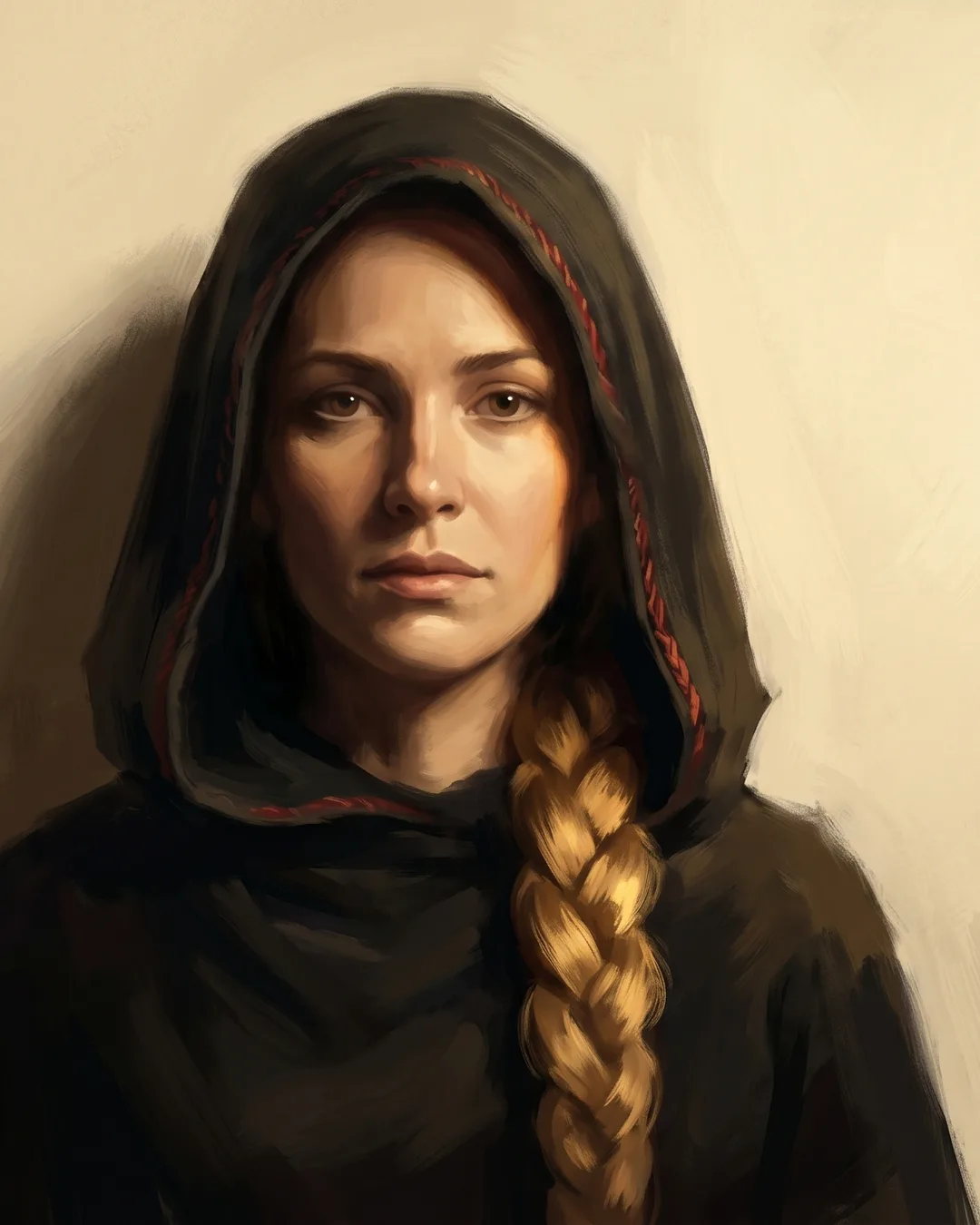
Painterly
This is the house style at Design Vortex, and the one I default to when a brief is ambiguous. Warm light, deep shadows, brushwork you can see if you lean in close. The lineage is oil painting, with a heavy debt to Frazetta and the older fantasy illustrators who treated a character like a body in real light, not a flat silhouette on a card.
Painterly is best for heroic player characters, party portraits, and anyone you want to feel weighty and a little old. It carries grime well. It carries gold leaf well. It carries the kind of haunted, mid-life paladin energy that a lot of long-running campaigns produce by year three. If your character has a story behind their eyes, painterly gives me room to paint that story into the work.
What it costs you is time. A painterly portrait takes longer than the other styles by a real margin, because the rendering pass is where most of the hours go. It also costs a small amount of legibility at thumbnail size. Painterly pieces want to be seen at full resolution, ideally printed. If your main use case is a 64-pixel Roll20 token, painterly is overkill and the detail will not survive the downscale.
Anime
Cell-shaded, clean line, expressive faces. The shadow work is graphic rather than atmospheric, which means the read is faster and the personality lands harder. Anime style is the one I reach for when a character is personality-forward, when the brief is full of phrases like "she always has this smirk" or "he never stops talking."
It works beautifully for younger PCs, for bards, for any character whose energy is kinetic. Anime is also the most forgiving style for distinctive hair, exaggerated weapons, and color palettes that would look garish in oil. A neon-pink coat reads as charm in anime and as a costume mistake in painterly. The style sets the rules for what is allowed.
What it costs you is suitability for grim and grimy aesthetics. I can paint a brooding anime character, but the style has an inherent brightness to it that fights against true horror or true gravitas. If your warlock has just made a pact with something cosmic and is unraveling at the edges, anime will undersell it. Pick a different tool.
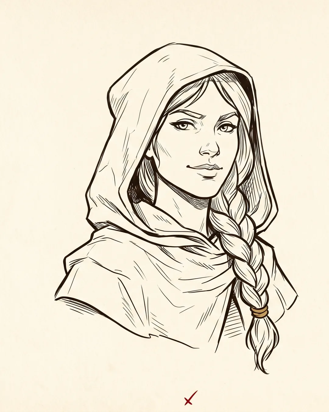
Lineart
Clean ink, light wash, a finished sketch feel. Lineart commissions are the workhorses of the studio. They are the right choice when speed matters more than spectacle, which covers a lot of real use cases: NPC packs for a DM building out a city, character sheet illustrations for a one-shot, secondary characters in a larger party shot.
A style is a delivery mechanism for the character. It is not a flex, and the goal of a portrait is never to show off the style at the character's expense.
Lineart also reads well at small sizes, which makes it the best choice for tokens and printable handouts. The sketch aesthetic carries a particular charm too. Some characters look better as a confident ink drawing than they ever would as a full painting, the same way some songs are better acoustic.
What it costs you is standalone impact at full resolution. Lineart prints fine, but it does not have the surface that painterly does. You will not get the same "wait, is that a real painting?" reaction when someone walks past it on your wall. That is not the job lineart is doing.
Semi-realistic
The fourth style, and the one I treat as a specialist tool rather than a default. Semi-realistic is closer to portrait painting than to fantasy illustration. The proportions tighten, the lighting becomes more naturalistic, and the work starts to read as a person before it reads as a character.
I steer people toward semi-realistic for heirloom pieces, gift commissions, and characters who carry a real-world resemblance the player wants honored. If your rogue is based on your partner's face, or your cleric is a tribute to a friend who passed, semi-realistic respects that lineage in a way the other styles cannot. It is the slowest of the four, and the most fragile to bad reference photos, so I ask for more material upfront when we go this direction.
How to decide
Here is the rough framework I use in client calls, when someone is genuinely torn between options.
- If you want a piece that lives on your wall, pick painterly.
- If you want a piece that lives on your character sheet, pick lineart.
- If you want a piece that captures your character's personality before their look, pick anime.
- If you want a piece that captures a real person, pick semi-realistic.
Most briefs answer themselves once you sit with those four lines for a minute. The rest are edge cases, and edge cases are where it helps to talk to me directly before locking the order in.
When the wrong style nearly shipped
Last month a player came in asking for anime. The brief described a half-orc cleric, late forties, missing an eye, mourning a dead wife, walking back into a temple she had abandoned twenty years earlier. The reference images they sent were all anime. The character they had written was not.
I pushed back gently. The grief in that brief was the load-bearing element of the piece, and anime's graphic shadow language would have flattened it. We talked it through on a fifteen-minute call, looked at a few painterly examples of older characters together, and agreed to move the commission to painterly. The final piece came out heavier and quieter than an anime version would have, which was what the character needed. The player has since ordered two more.
That is the kind of catch a brief intake is for. The style you arrive with is often correct. Sometimes it is not, and saying so is part of the job.
If you have read this far and you still are not sure which way to go, the easiest next step is to look through the portfolio with these four buckets in mind and notice which pieces stop you. That instinct, the one that pulls your eye, is usually pointing at the right style for your character.
When you are ready, the full breakdown of what each style includes, with current pricing and turnaround, lives on the character art services page. You can also skip straight to the order form and tell me about the character in your own words. I read every brief myself, and if I think you have picked the wrong style I will say so before I take the deposit.